Better form controls part 1: Date and weight inputs
A project I'm currently working on involves capturing a quantity of user information. It's fairly run of the mill of stuff, but there are a couple of data points that on the surface seem quite straight forward, but with a little inspection present some challenges and opportunities. Capturing date of birth is regularly poorly executed —I can never understand why this is so often done with a calendar widget. Another challenge is a personal weight input which, in addition to the complexity of various user format preferences, has issues beyond the mechanics of the UI that I'll discuss later.
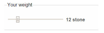
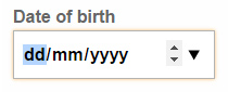
The current inputs I'm looking to replace aren't terrible — I've certainly seen worse — but they could be improved. The date of birth input is quite unforgiving in the format it will accept (but thankfully isn't a calendar!) and generates a lot of calls to the website support team. The weight (and similarily height) control doesn't have as many problems directly, but being a two step process it seems more complex than is really necessary. The requirement to be able to enter ½ pounds can cause confusion in its current implementation — illustrated in fig 1.


Prototyping: Weight
Approach 1: Range input
My initial instinct for the weight input is to use a sliding range form input.
Having quickly prototyped this with a snippet of javascript to update the display in real time, it's clear there are a couple of issues. Firstly, its not intuitive to use this format for non decimal input. Stones and pounds are the most popular format used on the website, so the point must reflect this in cycling through to 14. A problem, but not insurmountable.
Secondly, and more importantly, is the pyschological aspect of weight. The physical act of sliding upwards and seeing the weight ticking over rapidly could evoke negative feelings in users. Not what we want to achieve at all.
Approach 2: Unified inputs
The second approach is to inline the inputs in a manner that is akin to natural conversation — ‘ twelve–stone–two–pounds.’
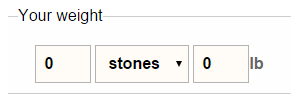
This approach allows the form to capture all the data required, but I'd like to try and simplify it a little.
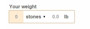
In Fig.4 I have styled the <fieldset> and <legend> surrounding the inputs to use the same styles as applied to a standard text input. I've also adjusted the inputs margins and padding to make the clickable targets extend to the edges, and added a highlight on the input that with the current :focus.
I've used <input type="number"> to enable a numeric keypad on mobile devices. Due to similar issues as those described for the range input type, I have disabled the browser default spinners on these inputs.
Prototyping: Date of birth
A major problem with the current implementation is the users are required to enter the data in a very specific format. My intention is to create an element that looks visually simple but encourages greater accuracy by requiring individual input for each fields.

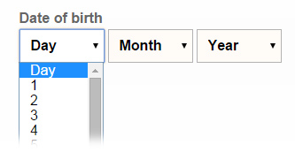
Approach 1: Separate <option>s
My initial approach was to use three drop downs to encourage extremely accurate input. I quickly rejected this as whilst it will ensure valid input, there is a chance it will encourage input of ANY date. When faced with 31 options, as with a day drop down, the user may be inclined to quickly choose at random and move on.
Approach 2: Native date input
I also tried a native browser date input, however I again quickly rejected this due to lack of consistent browser support, and not offering any particular advantage in the case of date of birth input.
Approach 3: Separate <number> inputs
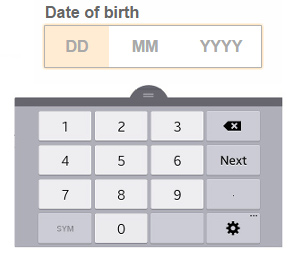
The approach I settled on for testing was to use three type="number" inputs styled to look like one unit. Forcing people to actively type their date of birth will help ensure data accuracy, and the type="number" will prompt mobile devices to use a numeric keypad. I disabled the browser ‘spinner’ controls to discourage random date selection and reduce visual distraction.
Test pages
For testing I created two demonstration forms with the inputs based on the process described above. Both forms request additional data to discourage the testers from focusing solely on the two input areas I specifically want them to use.
Test page 1 uses the form elements exactly as described above.
Test page 2 uses a similar approach but visually separates the inputs to see if this has any noticable improvement in completion rates.
Initial test results
I used the demonstration pages to conduct some ‘guerilla’ usability testing, consisting of nothing more scientific than putting an iPad, Nexus or Samsung tablet in a co–workers hands and asking them to fill out the form whilst I observed.
Initial results were pretty good. None of the test particpants had difficulty completing the form (bearing in mind they are probably above average in terms of technical ability). A couple of platform specific issues cropped up — Android enabled its in–page magnifier for one specific input, and Safari on iOS required a double tap to focus on some of the inputs — but this didn't impede completion and should be fairly trivial to fix.
There was no discernable difference in completion of the two styles of date or weight inputs. I'll undertake more formal testing as the larger project develops.