Approved Food
Prototyping UX updates
The brief
Take the layout from any category page or search results page and highlight any usability enhancements that would change/add to improve conversion rates and engagement.
- Provide the feedback as either an online/offline wireframe or semi–functioning html document.
- Please provide the rationale behind any changes and improvements.
- Please provide the time taken to complete the task.
Research
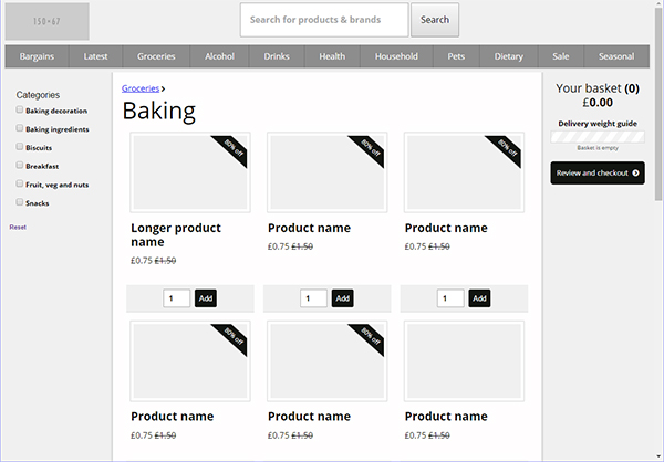
I chose the category page layout, as there are a number of opportunities for improvement here and I feel this type of page is critical for browsing and wayfinding on a site of this nature. Specifically, I chose the ‘baking’ category:
http://store.approvedfood.co.uk/baking
My solution
I created an HTML/CSS/JS prototype to test some of my ideas.
After initial brainstorming and sketching of potential improvements, I chose the shopping basket as a key area to focus on. During my time on site at the warehouse, we had conversations around groups of users who:
- Browse and add to basket from a mobile device throughout the day
- Optimise their baskets to make the most of the delivery allowances
Based on this, I gave the basket increased prominence by bringing it out of the header. On larger screens it is immediately adjacent to the main focus area, and 'sticky' when scrolling to remain in view. On smaller screens it is a first class standalone element with it's important call-to-action always in view.
Building on a feature that exists elsewhere on the site, I developed a weight guide indicator that responds immediately to items being added to the basket. Through animation, colour, and text I introduced a simple element of gamification - encouraging users to make the most of their delivery allowance.
Other changes in this prototype include:
- Updated the page <title> element to accurately represent the specific page, and be more ‘click through friendly’
- Added the pattern attribute to number inputs to force mobiles to use the number only, telephone style on-screen keyboard. Additionally added select-on-focus to these inputs for browsers that support it (not Safari)
- Made category filters sticky when scrolling, so they are always available
- Increased prominence of the product titles to improve scannability
- Created extra breakpoints to reflow the layout according to the available screen size
- Added breadcrumb style navigation to allow moving up the categories, and used the current page category as the crucial <h1> element
- Increased size of image thumbnails for clarity
- Visually simplified the ‘Save up to 70%’ messaging. Front-loaded those statements with the key figure
- Used the full width of the screen - there is a lot to display! In production this would likely need an upper limit
Things I specifically haven't done
This is a prototype after all!
- Created a complete page
- Polyfills or workarounds for older browsers, notably Flexbox
- Tested outside of Chrome/Edge on Windows 10, and Chrome on iOS9
- Navigation. A simple CSS only navigation is there as a placeholder. The current site implementation seems comprehensive and fairly new
- Adjusted the search form or filters for smaller screens
- Complex visual design
- Performance optimisation
- ARIA roles
Timings
Including research, configuring the page assets and specific gulp tasks, I estimate the task has taken in the region of 15 hours.
Note: This prototype has not been polyfilled or extensively browser tested, and is likely to fail in older browsers.
Currently tested on Chrome, Edge and IE11 on Windows 10 and Chrome and Safari on iOS 9.
Sample rendering