Paring back design
The whole should be more than the sum of its parts
It seems that perfection is reached not when there is nothing left to add, but when there is nothing left to take away.
Antoine de Saint Exupéry
One issue I have personally faced when designing sites or interfaces is an inclination to hone (or literally Photoshop Zoom) in on a small component and spend time working and re–working that specific part of the design. That of itself is not a issue, after all, ‘God is in the detail’. It can, however, become detrimental to a design when that component starts to become ‘overly designed’.
##Over designed
One component I spend a lot of time working is the simple button. Having spent time choosing the typeface and scale, picking the correct colours and setting appropriate whtespace with margins and padding, (which hopefully will be proportioned inline with the rest of the UI), the temptation can be to just add a border, or a slight gradient. Then a drop shadow and a little text–shadowing, to make it stand out — without realising it, your well proportioned, simple honest button is a masterpiece!… in isolation. Unfortunately, when viewed as part of the overall page and likely paired with other similarily OTT elements, the net effect can be overly fussy and ultimately detrimental to the success of the design.
A real example
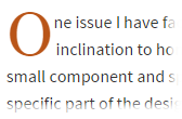
When creating this site I wanted to add an oversize drop–cap as a visual anchor point for the introductory paragraphs. I created some sample code and was reasonably happy with the way it looked in testing. Unfortunately, when viewed in the context of real pages, it felt in some instances as if it were fighting the other elements. There are already several combinations of typeface and size in that area of the page, and adding another didn't serve as the reference point I had hoped it would — it just clashed and actually had a distracting, negative impact. On it's own, I liked this small design element and I didn't want to let it go, but feel the design is stronger without it.
Having written about it here, I sneakily managed to get this little tiny bit of design in to a page in a way that doesn't disrupt the flow. For reference, the untested–in–anything–but–Chrome .scss for that is:
.post--intro {

    text-indent:-2px; // pull the second letter in

            &::first-letter {

                font:350% / 0.85 georgia, serif;

                float:left;

                padding:0 3px; // offset the indent

                position: relative;

                left: -2px;

                bottom:-4px;

                color:$accent;

            }

        }
So, cut it all out?
Not at all! As with many things, its about balance and necessity. Adding visual ‘flare’ simply for the sake of it may well have a negative impact but, in the right context, a gradient on a button, an inner shadow on an input or whatever it may be, can provide valuable affordance — suggesting to the user that the element is something to be interacted with or an important point of interest. For me, the key is keeping it simple and keeping it subtle.